Magazine Design · Green Pagoda
A magazine for succulent enthusiasts. Editorial Design · Systems Thinking · Visual Identity.
Editorial Design · Systems Thinking · Visual Identity
Green Pagoda Magazine
Category: Publication Design & Branding Systems
Project Brief
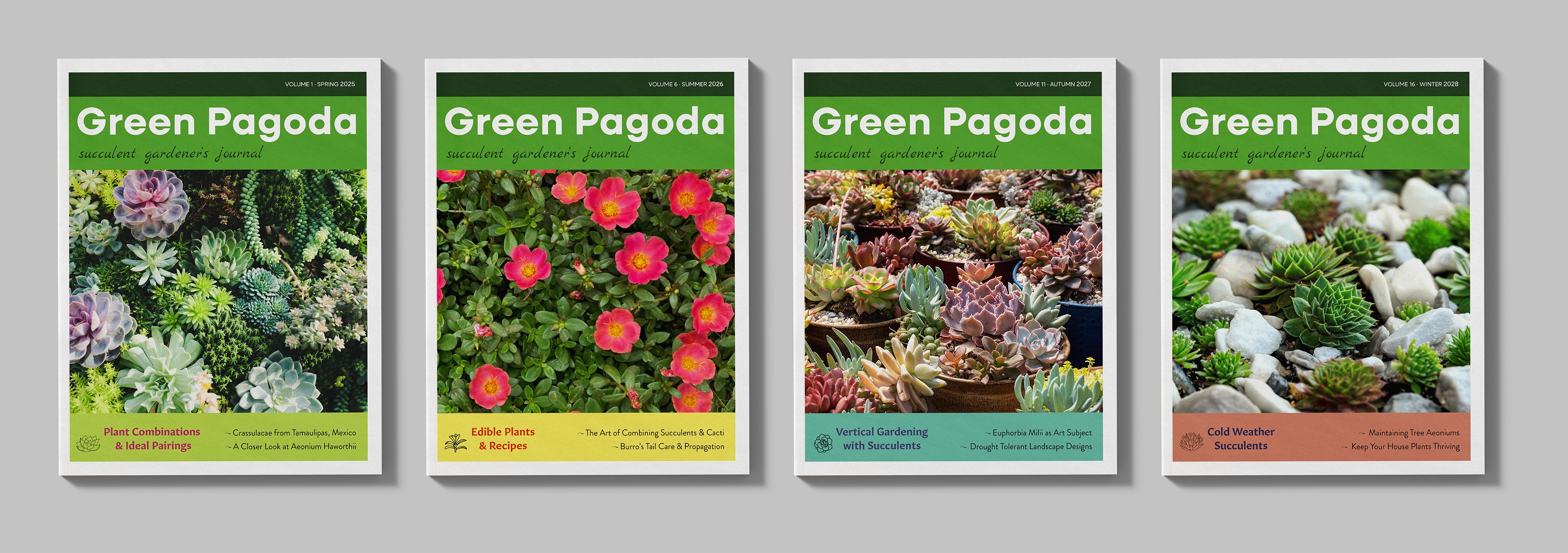
Green Pagoda is a seasonal lifestyle magazine centered on the beauty, culture, and design of succulents. This editorial design project includes a full visual identity for the publication featuring cover systems, spine treatments and interior layouts designed for clarity, consistency and calm. The project began as part of a publication design course and evolved into an exploration of systems thinking in editorial branding.

Design Concept
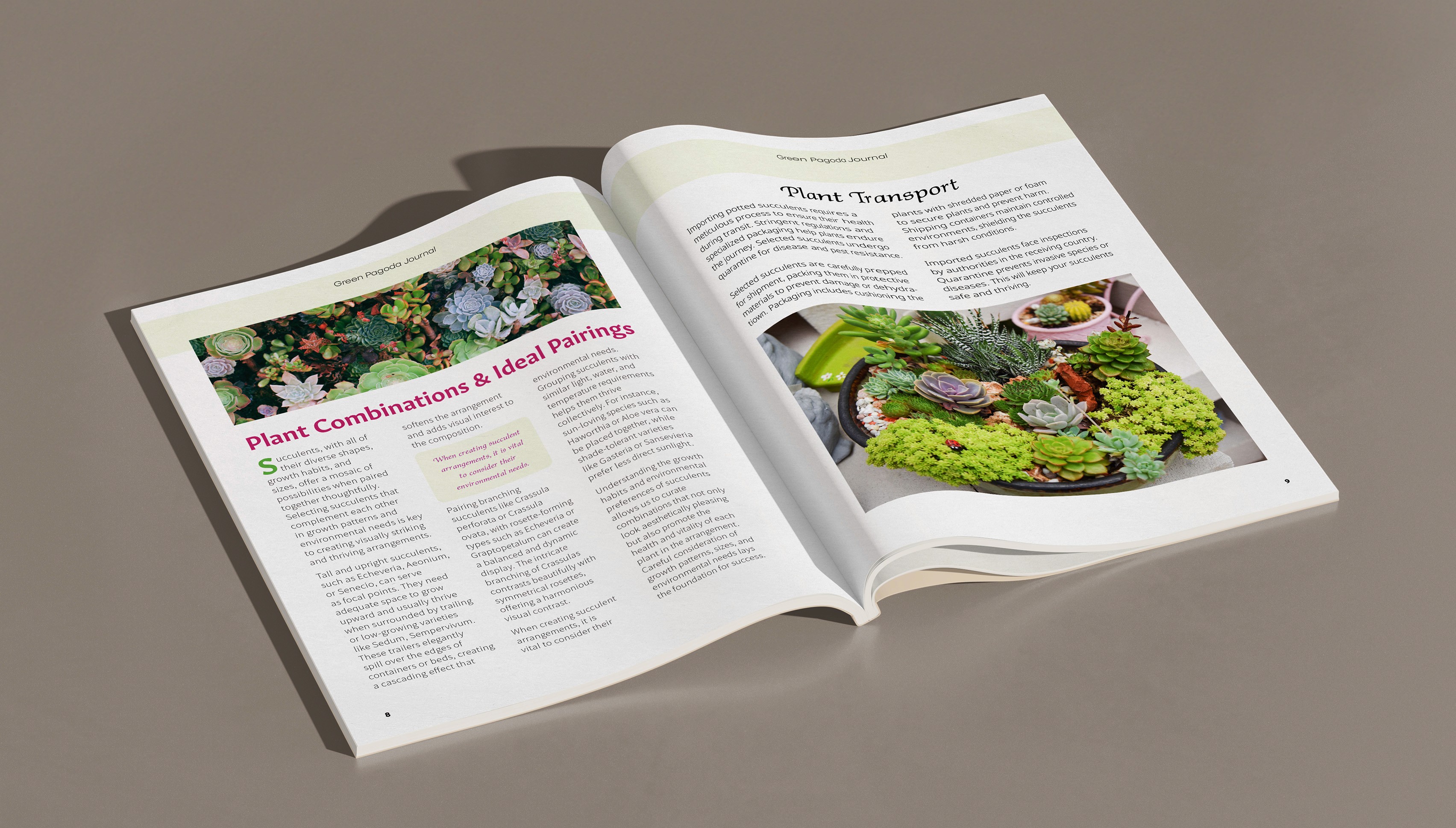
The name Green Pagoda was inspired by a succulent from my own garden and the architectural symbolism of a pagoda: a serene, protective space that invites reflection. The magazine draws on this idea through clean typography, soft color palettes and structured layout grids. The result is a reading experience that is both immersive and uncluttered.

Systems Thinking
A key focus of this project was creating a design system that could scale across multiple years of publication. Each issue includes a rotating seasonal wheel icon and a custom succulent illustration unique to that edition. The spine system stays consistent across seasons, but updates annually with a new color theme. Grids, margins and type styles remain fixed to ensure visual cohesion across spreads and issues.

Inner spreads use a 12-column grid to structure content with flexibility and visual balance.