Branding · Derby Museums Rebrand
A unified identity system for three museum locations, built for clarity and long-term growth.
Visual Identity System & Brand Expansion
Derby Museums Rebrand
Category: Cultural Branding & Print Design
Project Brief
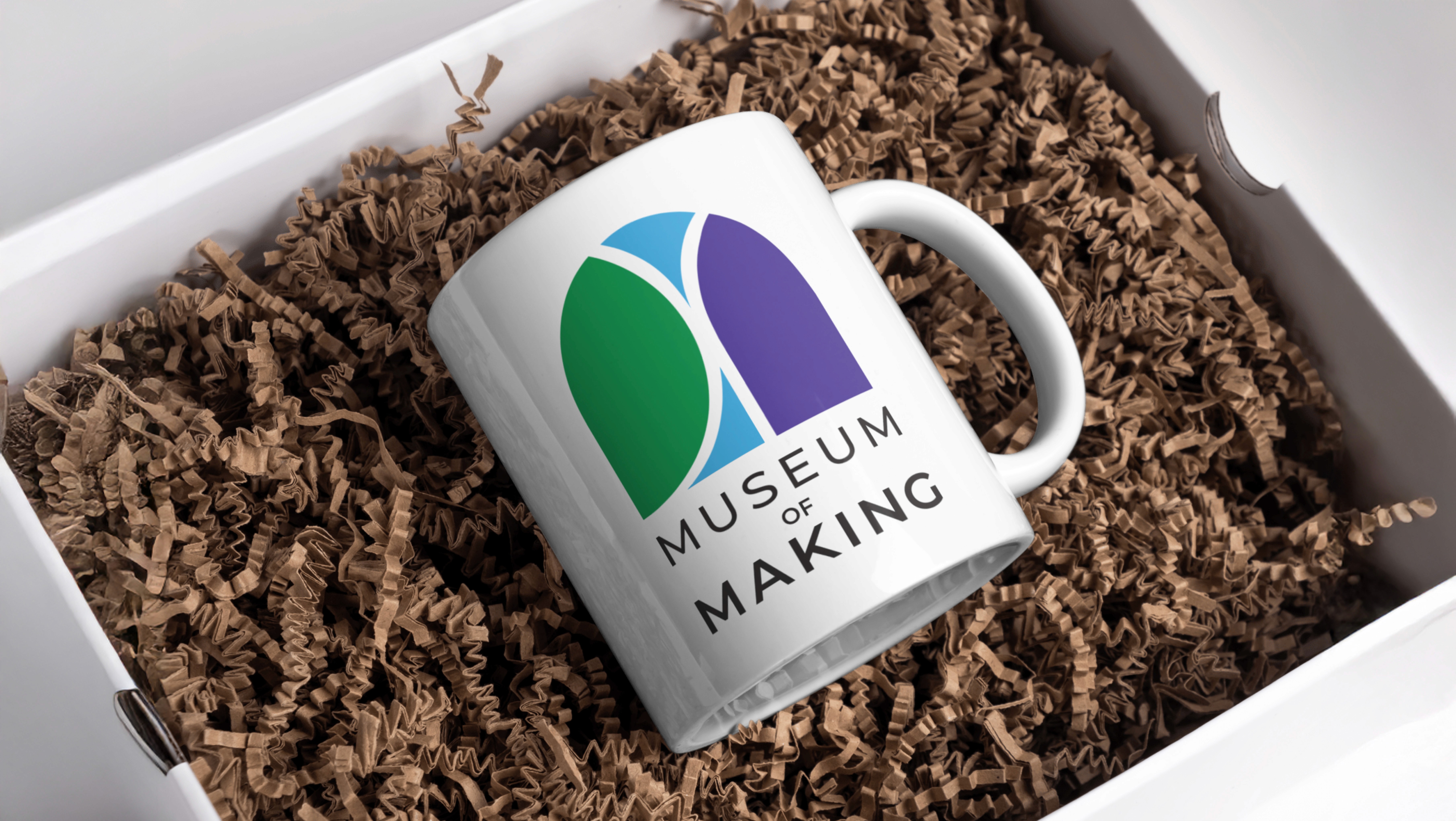
This rebrand unifies the identity of Derby Museums, which includes three locations: the Museum & Art Gallery, the Museum of Making, and Pickford’s House. Each previously used a separate logo and visual approach. The goal of this redesign was to create a cohesive identity system that brings the three sites together under one brand, while still allowing for individual expression at each location.

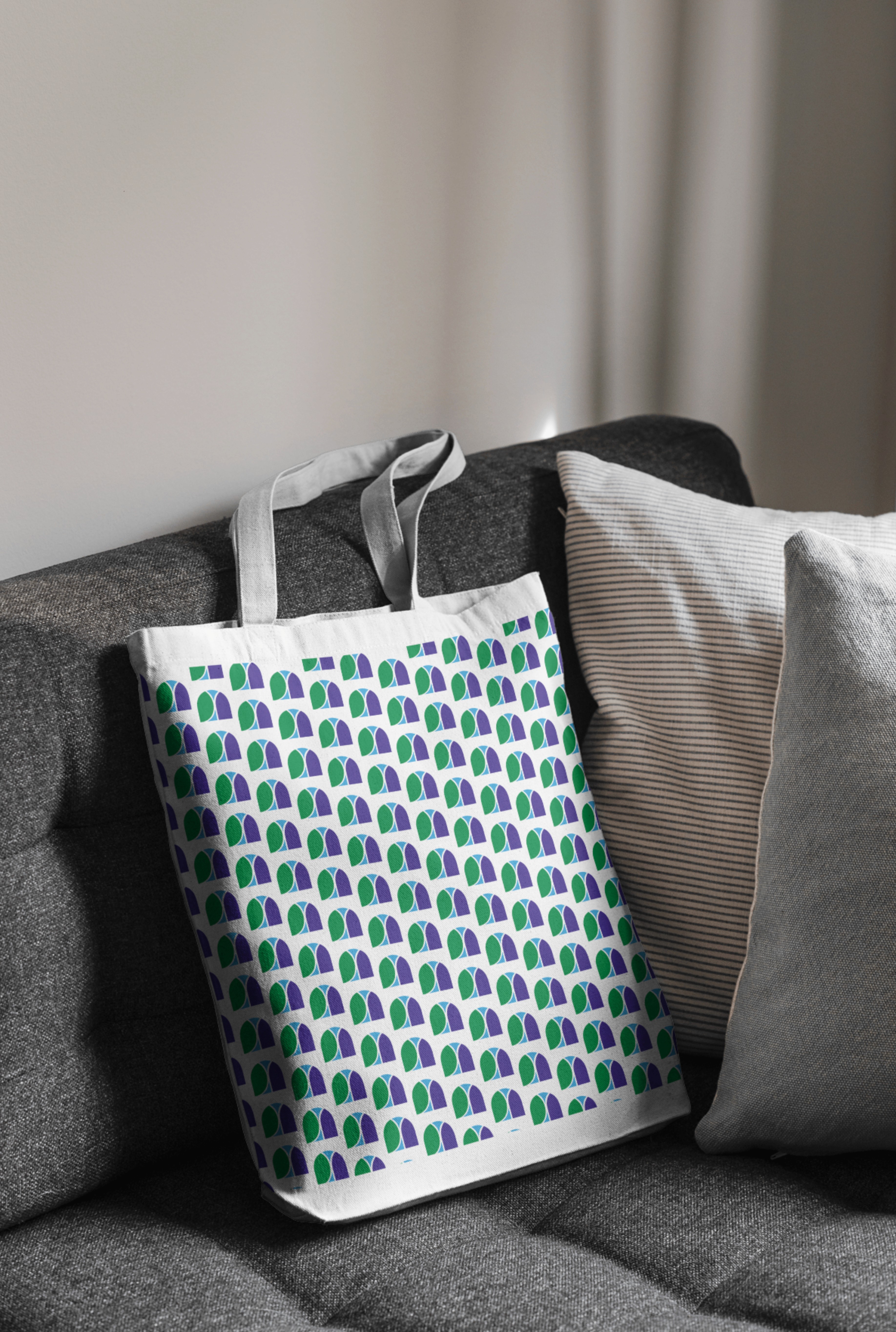
For this rebranding project, I deconstructed the Derby Museum's existing logo into three distinct shapes, each representing a branch of the organization. This allowed for a unified system that maintains visual connection to the original brand while giving each branch its own identity. By adding whitespace around each shape, I created unique outlines that both differentiate and elevate them from the parent logo.


Brand Applications
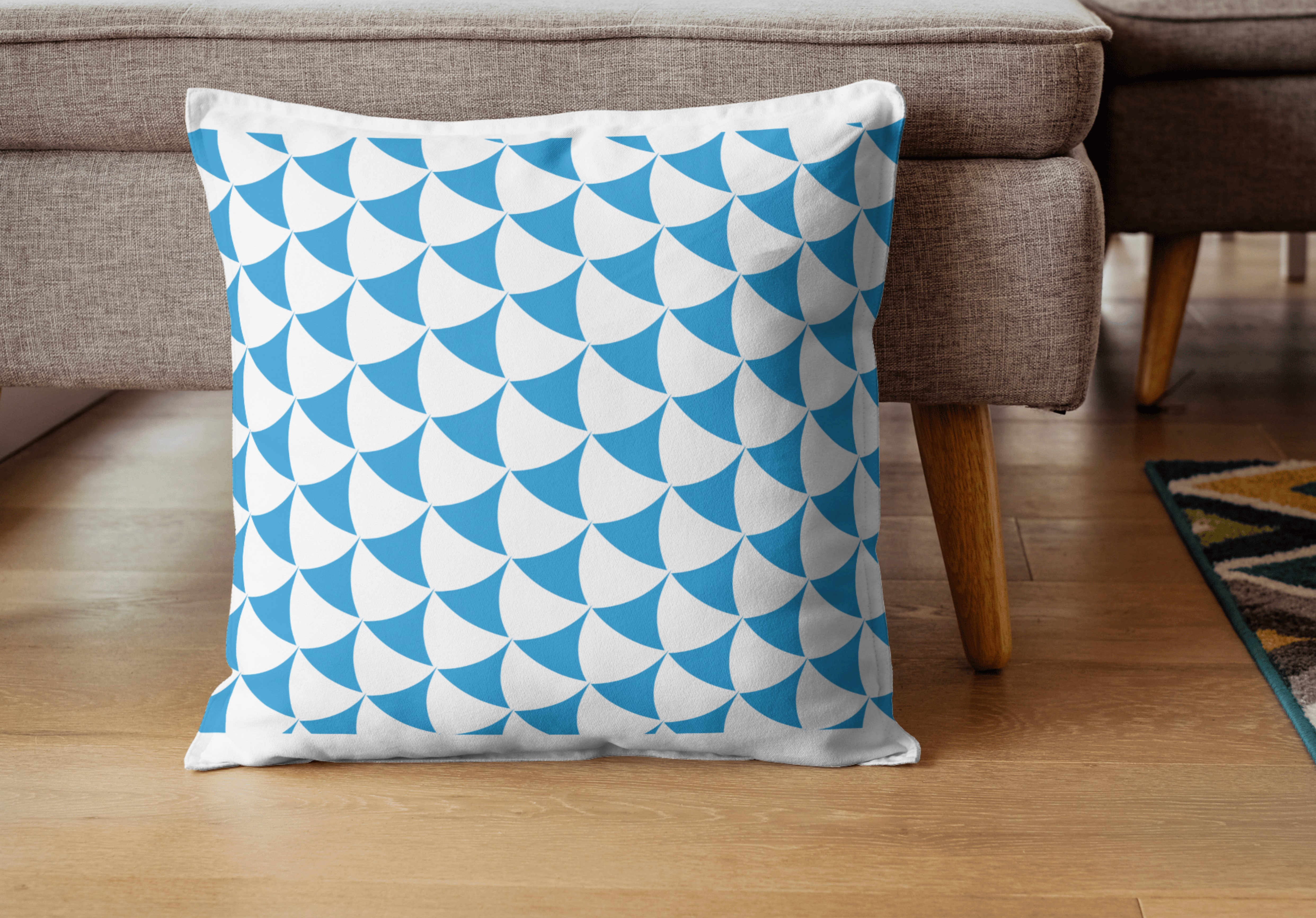
Signage, tickets and merchandise items apply the new visual identity across visitor touchpoints, from environmental graphics to retail design.